Spotify ‘Enhance’ Feature
- Project Type: Adding a new feature
- Role: UX/UI Designer
- Industry: Music, Entertainment
- Tools: Figma / Miro
- Duration: Mar 2024-May 2024 – 40+ hours
Why I Chose Spotify and This Feature
The problem I had is the Spotify recommended system is flawed and doesn’t give you the best recommendations, so my goal is to create more accurate recommended music, along with an organized structure of the playlist to show where the song was enhanced from originally. I chose this because music really resonates with me, and a good recommendation can lead to so much new knowledge in your music taste, or you may find your new favorite artist!
User Interviews
I asked three participants to take part in a short survey to gain their knowledge on Spotify as an app, and how frequent of a user they were. I also asked about the feeling of creating a playlist and coming back to it to use the ‘Enhance’ feature. Below is a summary of their experiences with Spotify and the ‘Enhance’ feature.
When using the app, users tend to use their ‘Liked Songs’ tab as a playlist. All participants said this is a frequent occurrence, because many people don’t want to take the time to create a playlist, or the features of the playlists are to bland for the constant user, making it less entertaining to stream music.
The ‘Enhance’ feature doesn’t work how it is intended. With the use of the ‘Enhance’ feature, you want to find something new, or enhance the current state of your playlist. My participants noticed that the feature isn’t very accurate when implementing new music, it has a knack for playing a song that doesn’t fit the playlist mood, or general genre.
Problem Statements
From this point, I had a large list of statements on how to change the process of this feature to better the experience for the user. I tried to keep my focus on the statements presented below to help narrow down my process but also keep my options open for change.
- How would I make the feature more engaging for the user?
- Try to center the feature as being used to find new music and add it to your playlist.
- If a recommendation happens from a specific song, have an indicator specifying where that song may have come from.
Proposing Solutions
Throughout my research, I noticed the users had an strong interest in using Spotify and what the playlists have to offer, but their progress was impeded due to the lack of engagement Spotify has with their users. The wireframes presented are presenting what is listed below.
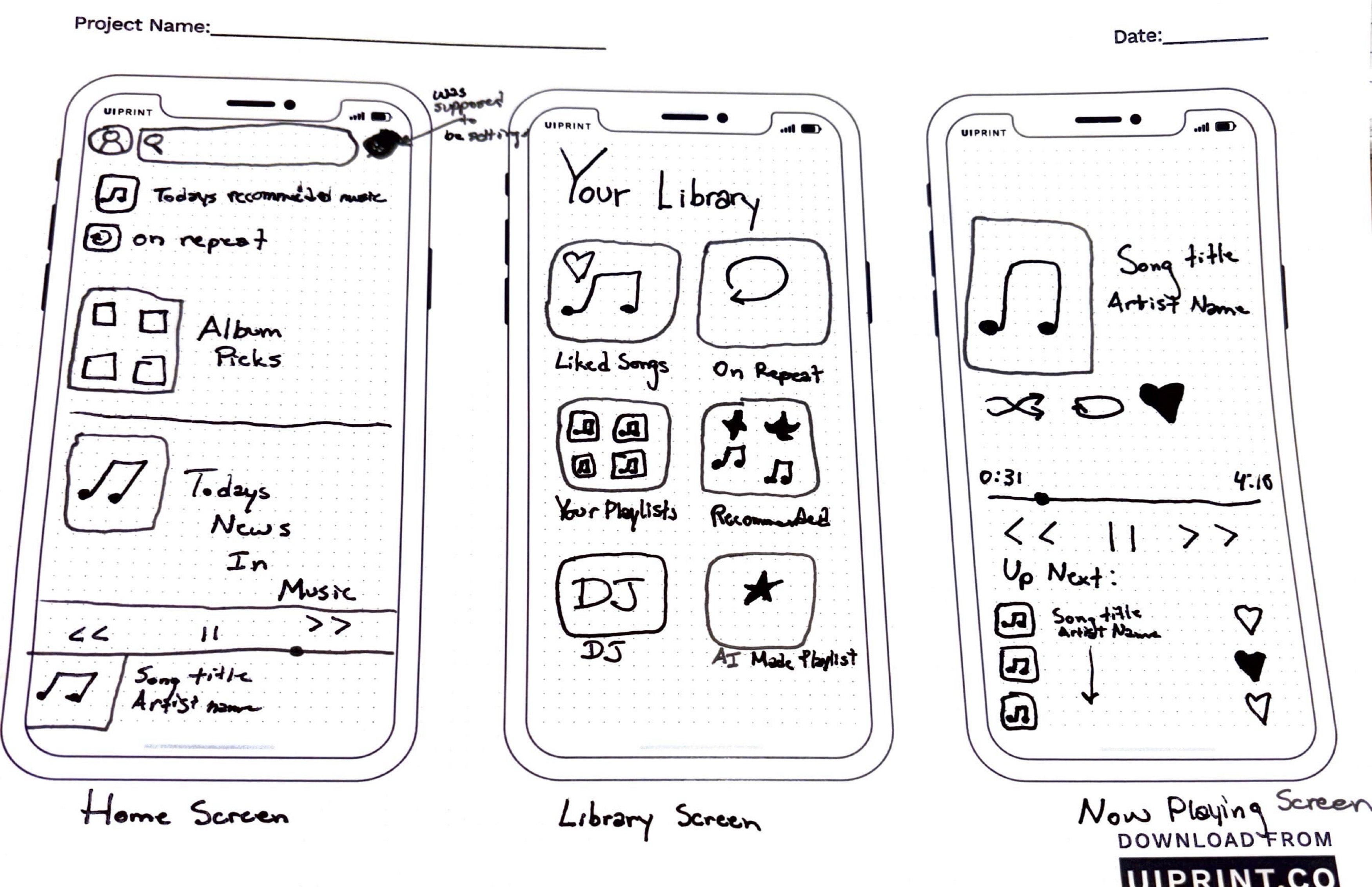
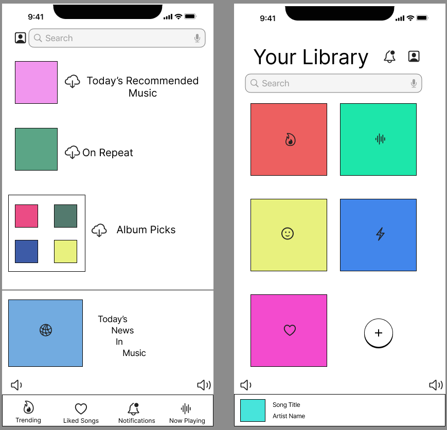
- Screen 1: Created a Slightly different menu to make it more engaging for users
- Screen 2: Made the library page easier to view and choose what you want to listen to
- Screen 3: Made the now playing tab present recommended music that you can add to your queue or likes
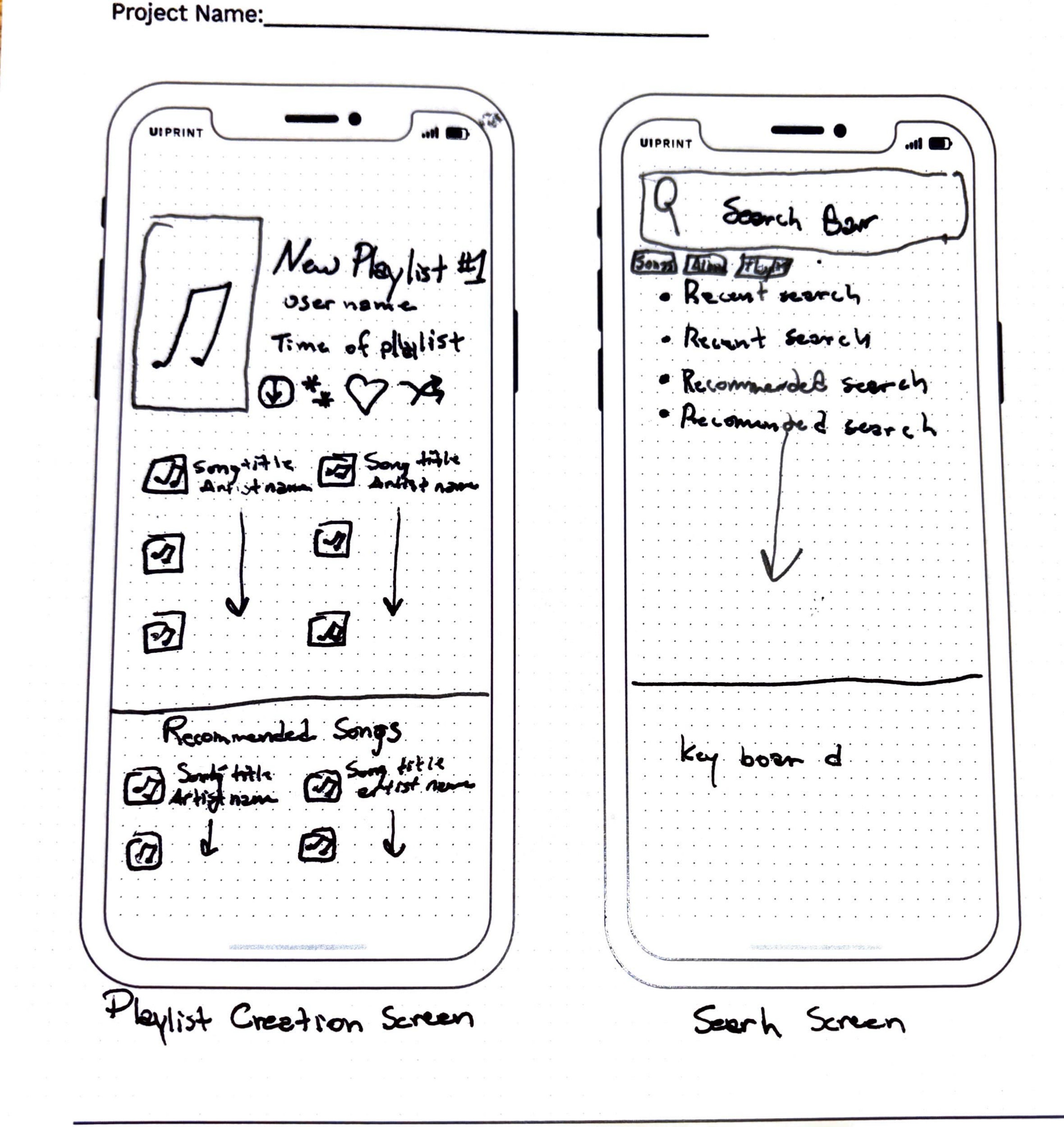
- Screen 4: Made the Playlist structure slightly different with a recommended tab more presentable
- Screen 5: Made a search bar with not only recent searches, but also recommended searches based on recent listening
Digital Low-Fidelity Wireframes
When going through my wireframe sketches, noticed I wasn’t satisfied with the way I created the playlist structure. I tried to apply attention aspects with colors, the order of the lists, and the icons I am presenting in these wireframes.
Moving to the aspect of perception, I think Spotify does a good job at making things somewhat self explanatory, making it easy for the user to engage.
For the aspect of memory for the user, I made the interface easy to understand and clear what icons are what and how to use them.
Findings
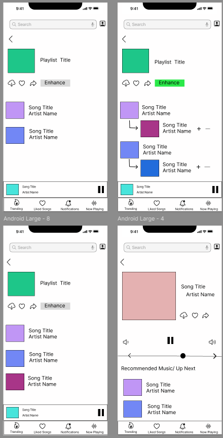
Throughout these prototypes, I found that changing the structure of the playlist to make it more of a drop down menu after you click on the ‘Enhance’ feature. The other screens are added to show a more developed form of how I hope the UI looks like in the future.
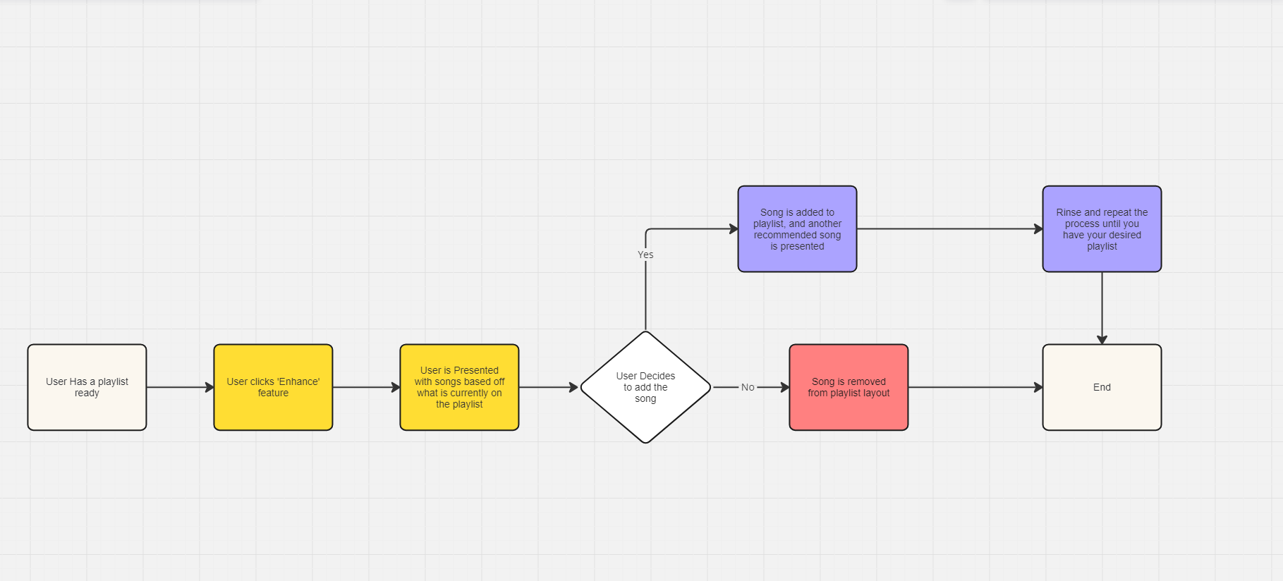
Playlist Mind Map / User Flow
Presented is a mind map / user flow chart that shows a users interaction with the ‘Enhance’ feature. I tried to make interaction easy because finding and listening to the music is a focal point of this app. My high-fidelity prototype shows the interaction with the ‘Enhance’ feature and the different UI that comes with it.
What Next?
After creating my high-fidelity wireframes on Figma, I gained a lot of new UX / UI design knowledge and a lot of new design tool skills. Redesigning such a simple feature so it is noticed that it is used was quite a bit of a process and I had a lot of troubleshooting with creating different low-fidelity wireframes throughout my process. I hope to add more frames to this in the future and create an even more in-depth version of my prototype so users know that finding new music shouldn’t be a hard process.
